We’ve been wondering – what makes a great label? We asked AMM member Cathy Hamaker, Leonid Production LLC, a museum exhibit and interactive developer located in Indianapolis, Indiana, to share a few great labels they’ve spotted “in the wild” recently – and what makes those labels so great.
When I teach my class in Exhibit Planning and Design at Indiana University at Indianapolis, I often spend two whole lectures talking about exhibit text and labels. This is partly because labels are one of my favorite things to talk about generally, and because I feel that while most of my students are not likely to become exhibit designers per se, there’s an excellent chance that some of them will at some point write a label that a visitor is expected to read. Badly written labels are everywhere, and I’d just as soon my students don’t inflict terrible text on innocent readers. Not on my watch! Toward this end I have a sizable collection of example photos of Bad Labels—too wordy, too busy, poor contrast, bad color choices, worse font choices, mysterious random facts unconnected to nearby exhibitry—the list goes on.
I’m embarrassed to say that my collection of photos of good labels is much smaller; not because there aren’t good labels aplenty in our institutions, but because we sometimes overlook documenting what’s done well at the expense of what’s been done poorly. This is something I plan to correct in future, and to kick it off I’d like to show you all a few labels I’ve seen in recent years that strike me as great examples of the art.
GERALD R FORD PRESIDENTIAL LIBRARY AND MUSEUM
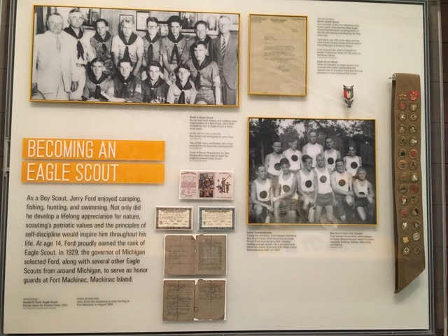
I stopped by the Ford Museum while at the 2019 AMM conference in Grand Rapids. One type of label I really enjoy are ones that integrate collections objects with photos and text in a visually dynamic way, and this is a great example in my opinion. While most of the scouting objects here are not super-colorful, the use of that bright orange-yellow as a pop color both for the header background and the frames around the photos/letter brightens the whole label without pulling focus away from the assemblage of objects and the explanatory text. I also appreciate that the body copy is short, to the point, and emphasizes President Ford’s lifelong connections to the state of Michigan.
THE CHILDREN’S MUSEUM OF INDIANAPOLIS
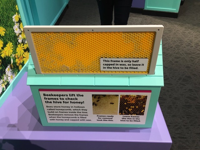
Interactive development is also one of my interests, and The Children’s Museum of Indianapolis has some amazing ones. I love the way the developer in this instance has combined a prompt for what to do (lift up the frame to check for “honey”) and a few key facts about bees and beekeepers with a simple mechanical interactive. I also like that the prompt for reset—“leave (this frame) in the hive to be filled”—is part of the content delivery rather than simply “Please reset this activity for the next visitor.” Reset is often a complicated aspect of interactive design, and it’s great that it’s baked into the activity here.
INDIANA STATE MUSEUM
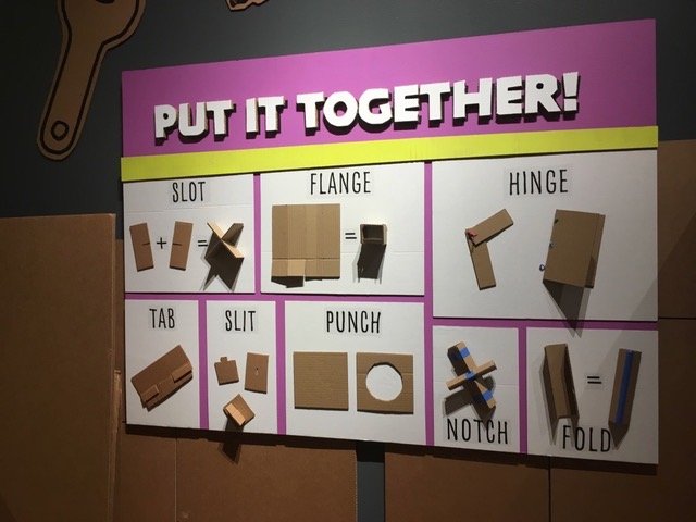
In 2018, the Indiana State Museum put together a beautiful exhibit called “Cardboard Engineering,” which encouraged visitors to create amazing constructions out of cardboard using basic tools. This prompt label is deceptively simple, and I absolutely love it. Eight different ways of connecting/manipulating the basic material of the exhibit are illustrated with real dimensional pieces rather than flat diagrams; the “Put It Together” header serves as a prompt and as encouragement—yes, you can tear, cut, and manipulate cardboard to build what you want—and it too is dimensional, made of layers of cardboard built up and then cut to letter shape. The choices of bright pink and yellow liven up the otherwise dull color of the cardboard samples, pulling this piece together nicely.
THE MÜTTER MUSEUM
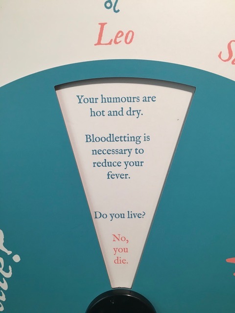
The Mütter Museum in Philadelphia is best known for its somewhat gruesome displays of medical specimens; however, they also have a great temporary exhibit space which in 2021 had an installation called “Going Viral.” Planned pre-pandemic, it focused on the topic of our understanding of infection throughout history. This included an explanation of the humour theory of health, coupled with an interactive matching one’s zodiac sign with its supposed humour profile. I really liked the wedge-shaped and center justified text layout in the revealed window of this simple dial-turn interactive. The finality of “No, you die” at the point of the wedge, with one word per line, struck me as both hilarious and a very clear communication of the message of the interactive: humour theory is not a good way to treat disease, no matter what your sign is.
GATORLAND
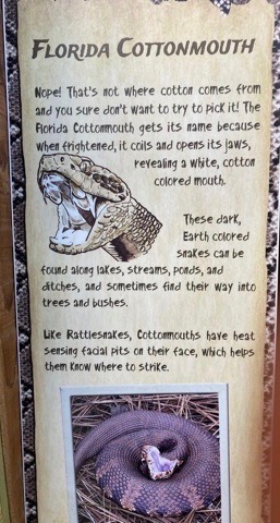
From here on out, when I try to explain “voice” to my students or clients, I’m planning to use Gatorland Zoo in Orlando as my best example of choosing and using a consistent voice for labels. Gatorland is a great zoo—don’t be fooled by the giant plaster alligator jaws at the entry, they are doing some very cool education throughout their park. They’ve very deliberately chosen a folksy, friendly, and approachable voice for their label text, as seen in this example next to a live animal display. Key points about cottonmouth snakes are covered without getting excessively wordy. Their chosen hand-printing styled font reinforces the tone of the text as well. While I’ve not talked to any of Gatorland’s content writers, I suspect that their label voice is also intended to emphasize the difference in approach between their zoo and other nearby well-known attractions…
IN CONCLUSION
When you’ve got an exhibit to install and a short time to do so, it’s often easy for label writing and design to get pushed to the back of the priority list. But even a little thought given to length, voice, layout, and placement can transform an adequate label into a great one. I look forward to adding more fantastic labels to my lectures in the future!